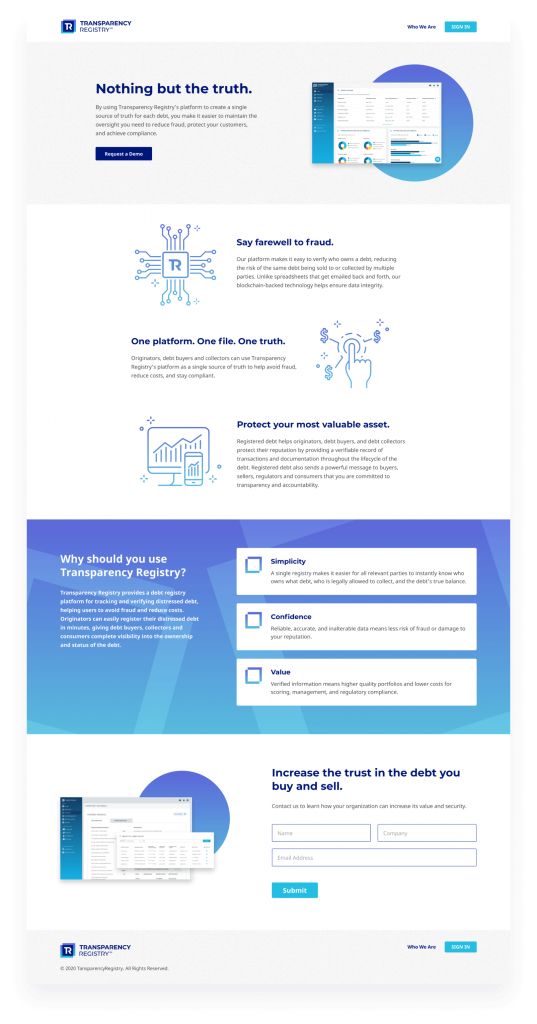
Designed to inspire trust, this blockchain-based platform leverages technology to provide debt originators, debt buyers, collectors, and consumers with a single source of truth.
Transparency Registry provides a Fintech solution for accurately and securely tracking and verifying distressed debt from the point of its origination. By registering data using blockchain technology, Transparency Registry helps debt originators, buyers, and collectors protect their reputation by providing a verifiable record of transactions and documentation throughout the lifecycle of the debt. For consumers, registered debt means it is verified and legitimate, helping them know exactly who the collector is and how much they owe.
Transparency Registry provides a Fintech solution for accurately and securely tracking and verifying distressed debt from the point of its origination. By registering data using blockchain technology, Transparency Registry helps debt originators, buyers, and collectors protect their reputation by providing a verifiable record of transactions and documentation throughout the lifecycle of the debt. For consumers, registered debt means it is verified and legitimate, helping them know exactly who the collector is and how much they owe.
The Challenge
Use smart design and UX/UI best practices to make a complicated process simple and easy for multiple user types.
UNDERSTANDING THE USERS
When designing the Transparency Registry platform, there were many user types to consider. For simplicity of purpose, these audiences were divided into three main categories – Organizations, Consumers, and Administrators – each of them had their own unique goals and challenges.
Designing for Organizations
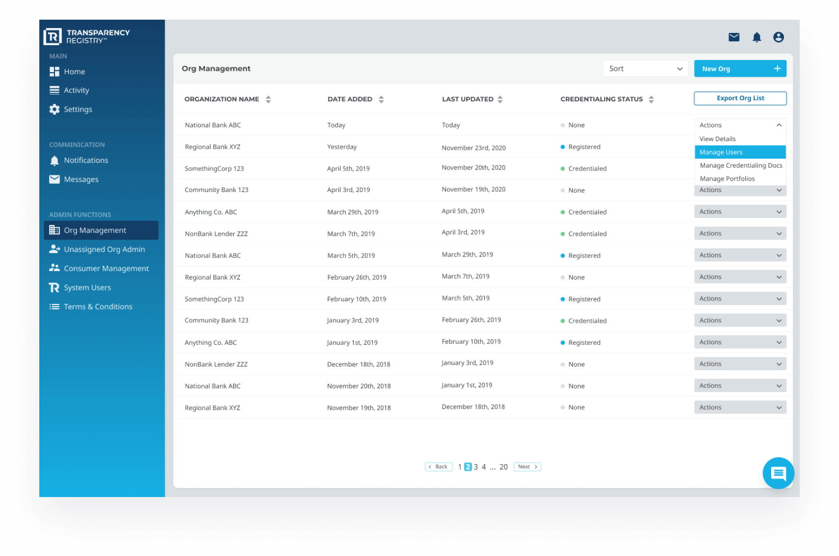
The first category is Organizations. These are debt originators, debt buyers, debt collectors, and government agencies. With no current centralized method for tracking the life cycle of debt, debt can be bundled with other debts and sold over and over again without a clean record of these exchanges. Debt is only as valuable as one can prove the accuracy and legitimacy of the information. By registering debt on the Transparency Registry platform, these organizations can avoid fraud, reduce costs, and determine the value of their holdings.
Designing for Organizations
The first category is Organizations. These are debt originators, debt buyers, debt collectors, and government agencies. With no current centralized method for tracking the life cycle of debt, debt can be bundled with other debts and sold over and over again without a clean record of these exchanges. Debt is only as valuable as one can prove the accuracy and legitimacy of the information. By registering debt on the Transparency Registry platform, these organizations can avoid fraud, reduce costs, and determine the value of their holdings.
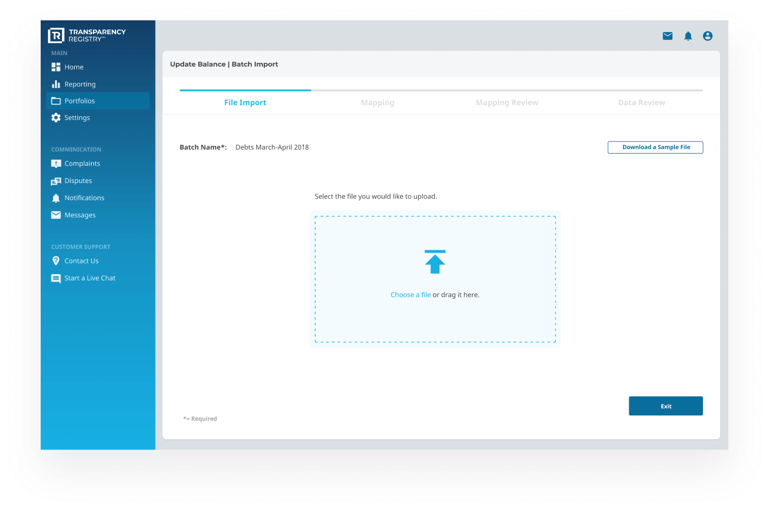
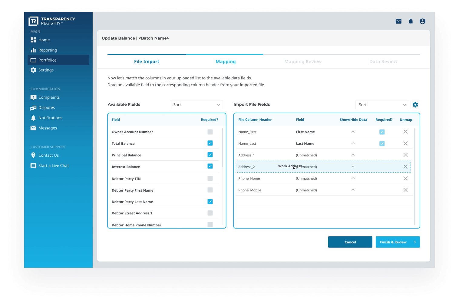
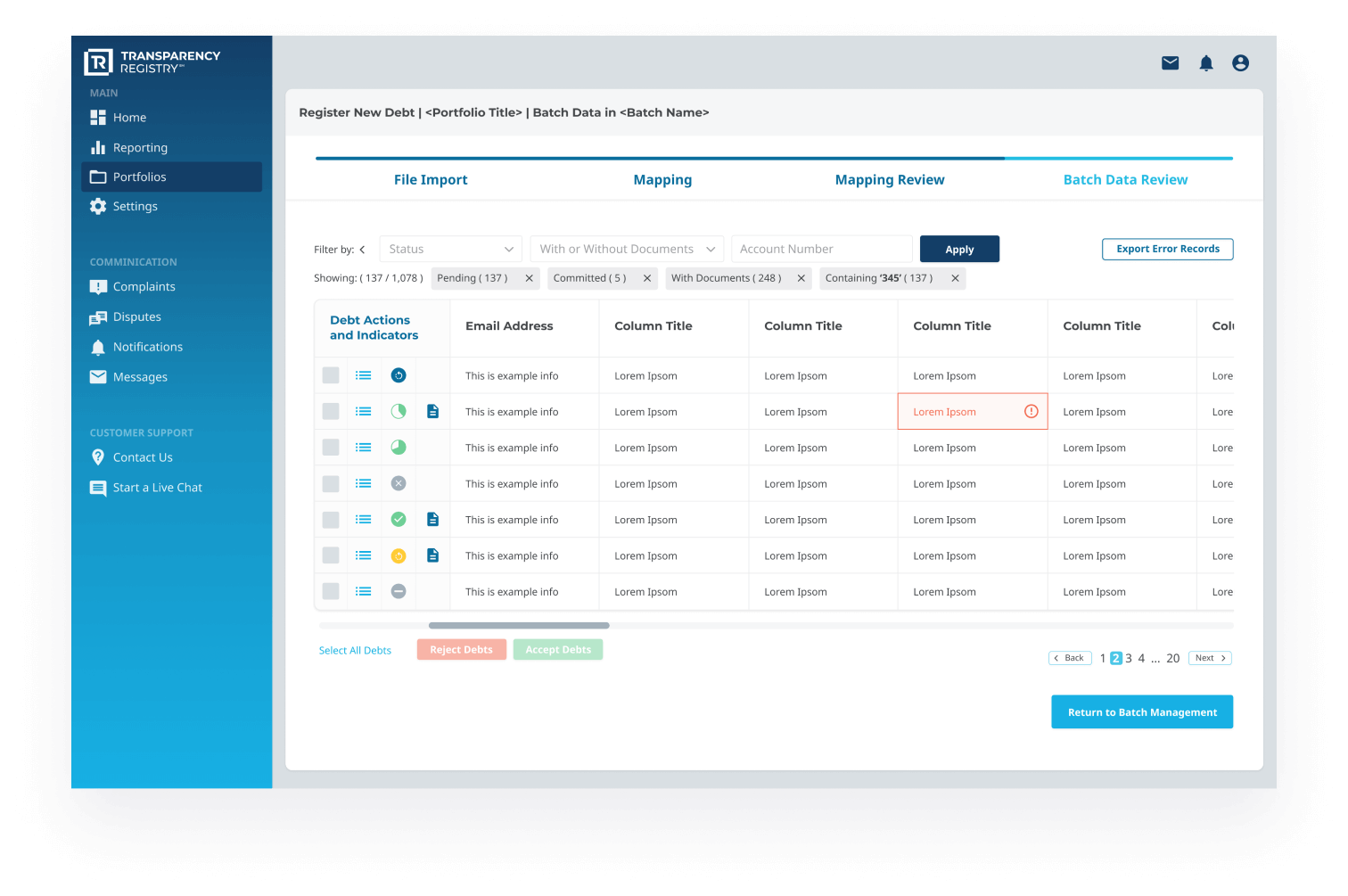
Most of the user experience challenges during the project were in this category. We had to overcome a significant hurdle when attempting to decrease the time to value for this user category. Traditionally organizations deal with massive amounts of portfolio data presented in Excel or CSV format. Without having a unified file format standard across the industry, we needed to develop a way for immense quantities of information to be uploaded to the system, mapped to required categories, and verified for accuracy.
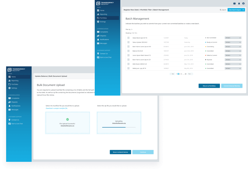
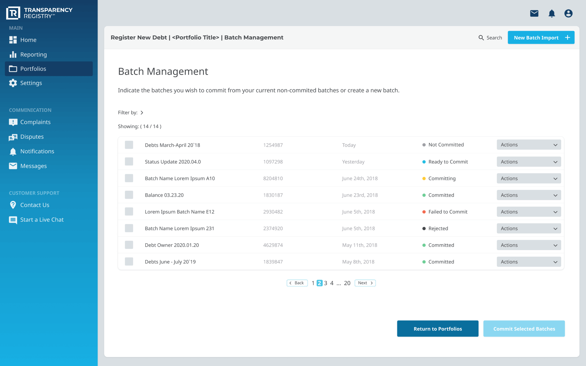
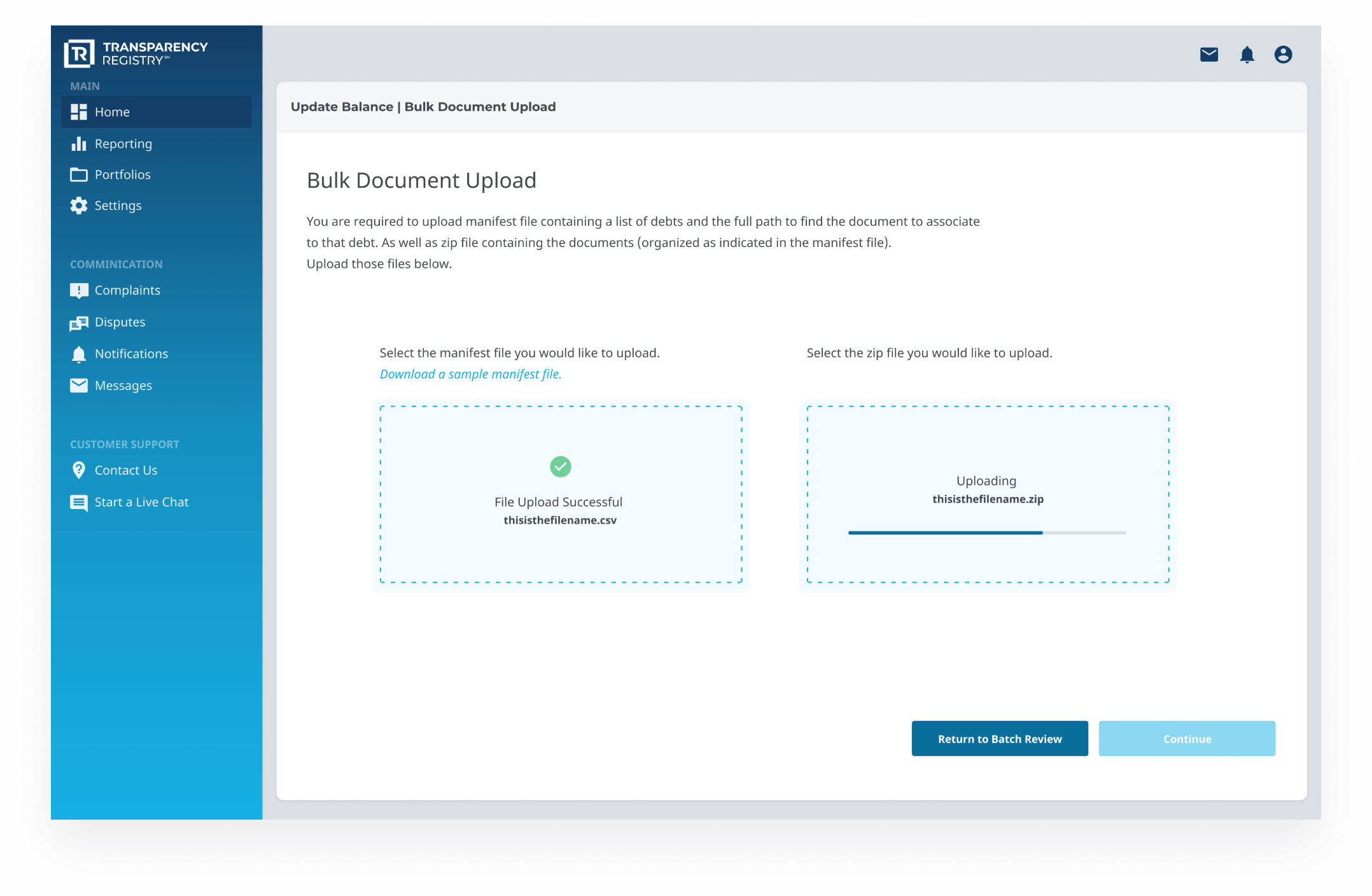
Because of the sheer volume of potential debts that need to be uploaded, the process has the potential to take an organization a fairly lengthy amount of time to complete. To help streamline the process, we designed features like batch data review and bulk document upload.
Once this information was in the system, we then needed to develop a way for these users to manage their inventory and make updates over time.
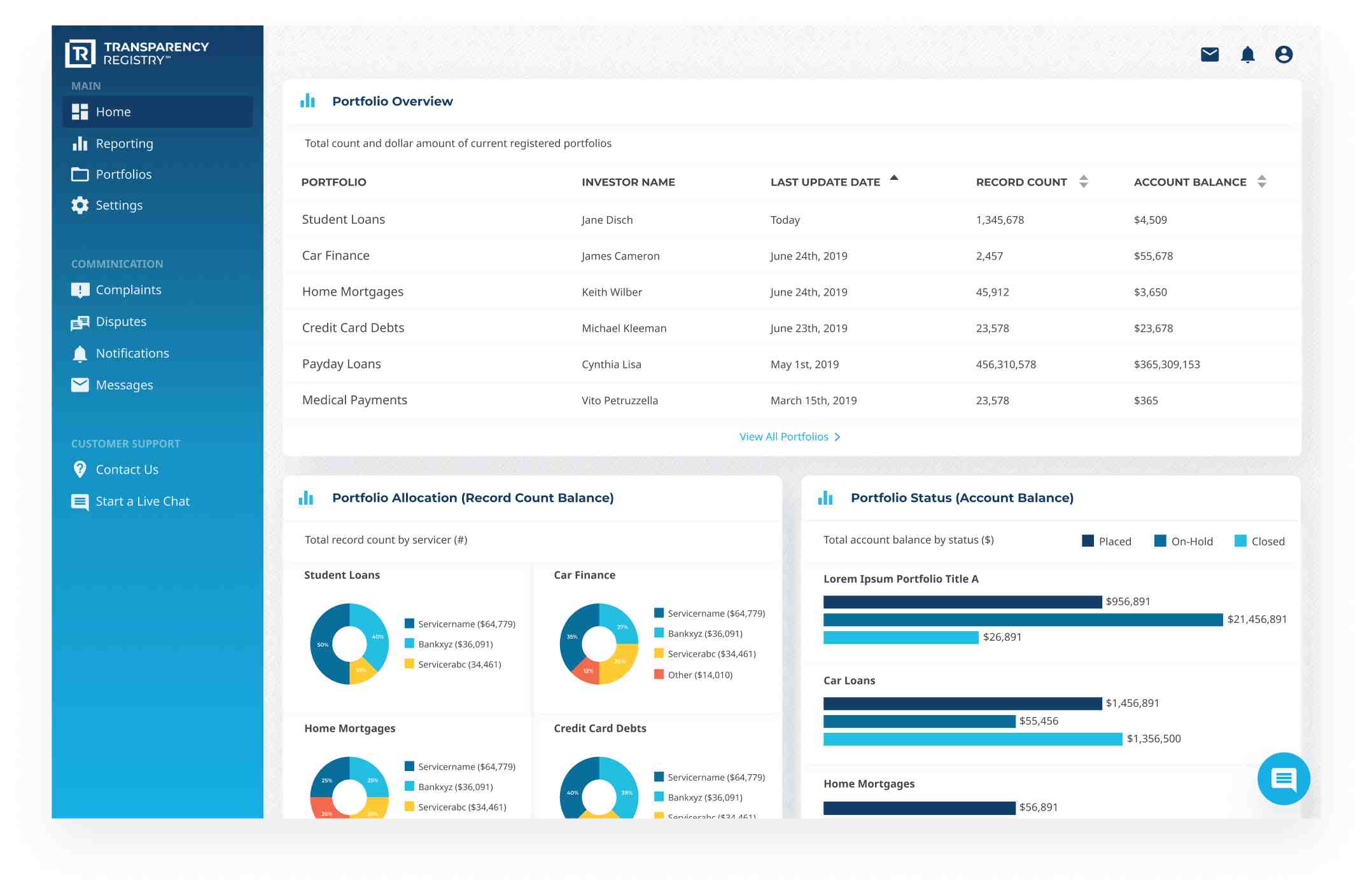
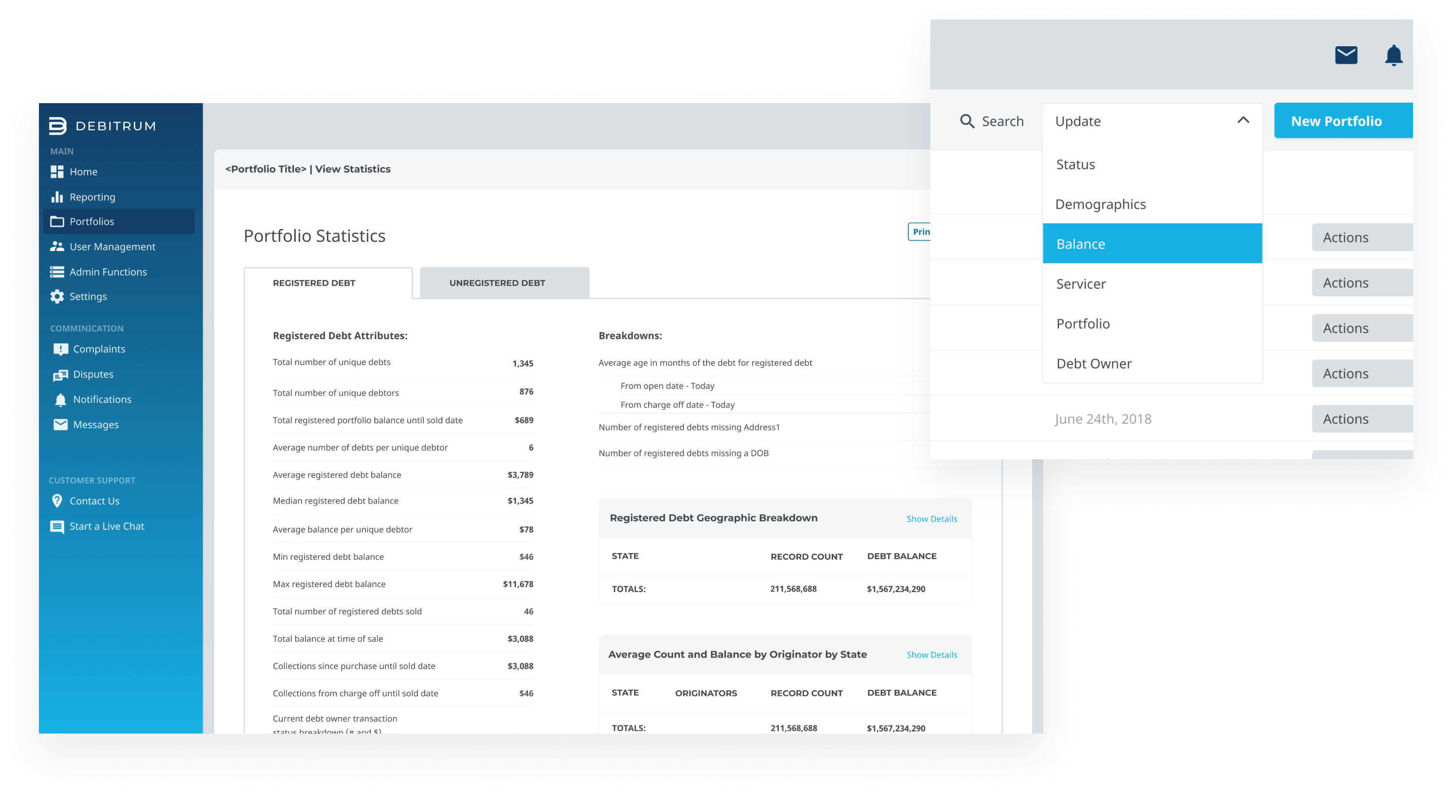
A major value that Transparency Registry offers these organizations is a visual representation of the statistics associated with their portfolios. Having this information available at a glance makes all conversations these organizations have with each other around buying, selling, and regulating the debt easier and more effective.
A major value that Transparency Registry offers these organizations is a visual representation of the statistics associated with their portfolios. Having this information available at a glance makes all conversations these organizations have with each other around buying, selling, and regulating the debt easier and more effective.
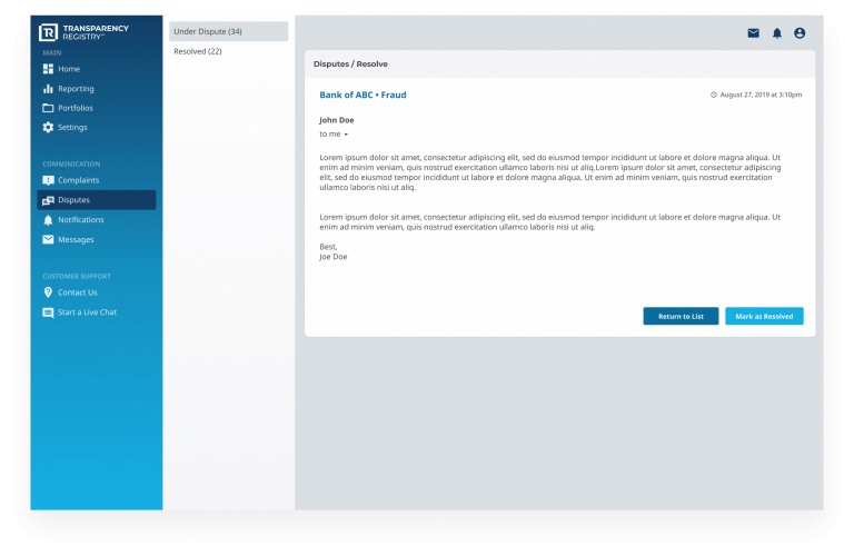
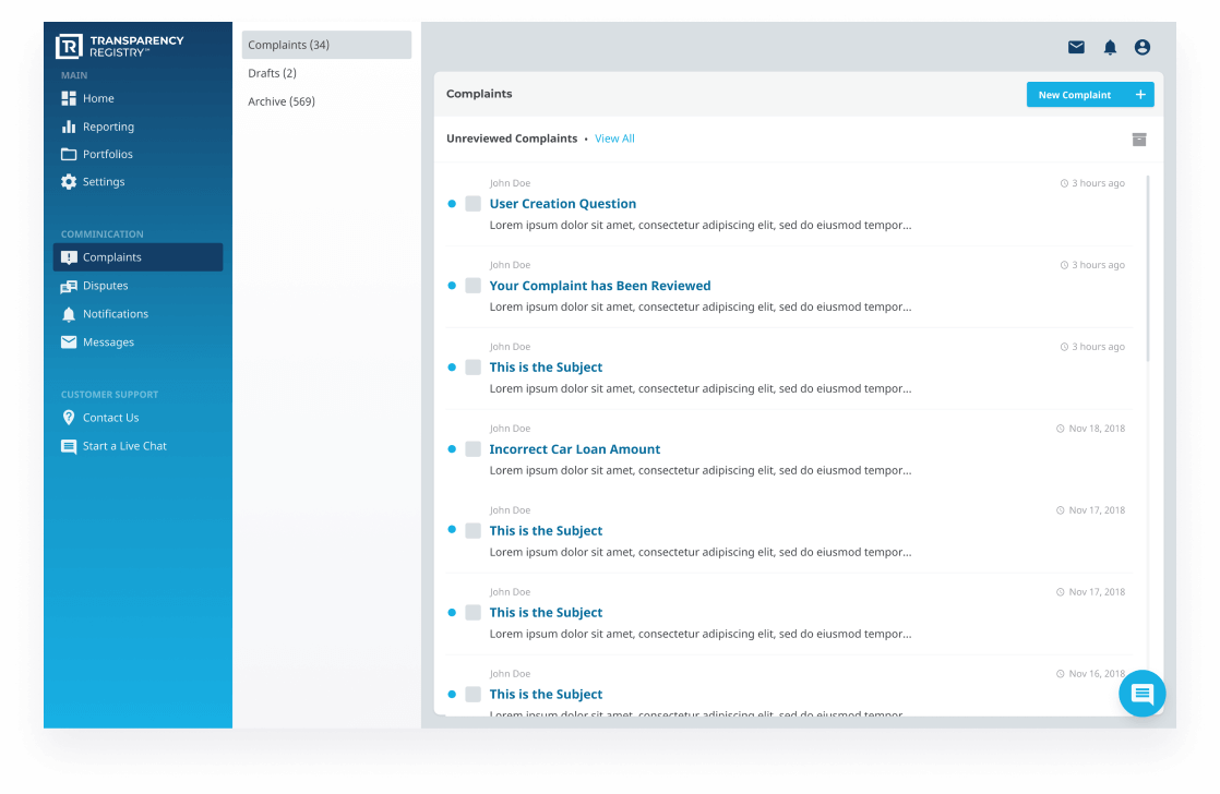
Because this could be the first time these unique groups are comparing their records against each other, a system for logging complaints and disputes became a prioritized feature.
DESIGNING FOR CONSUMERS
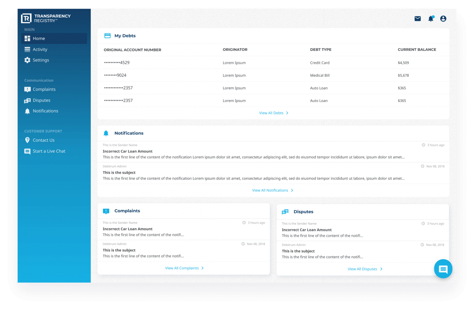
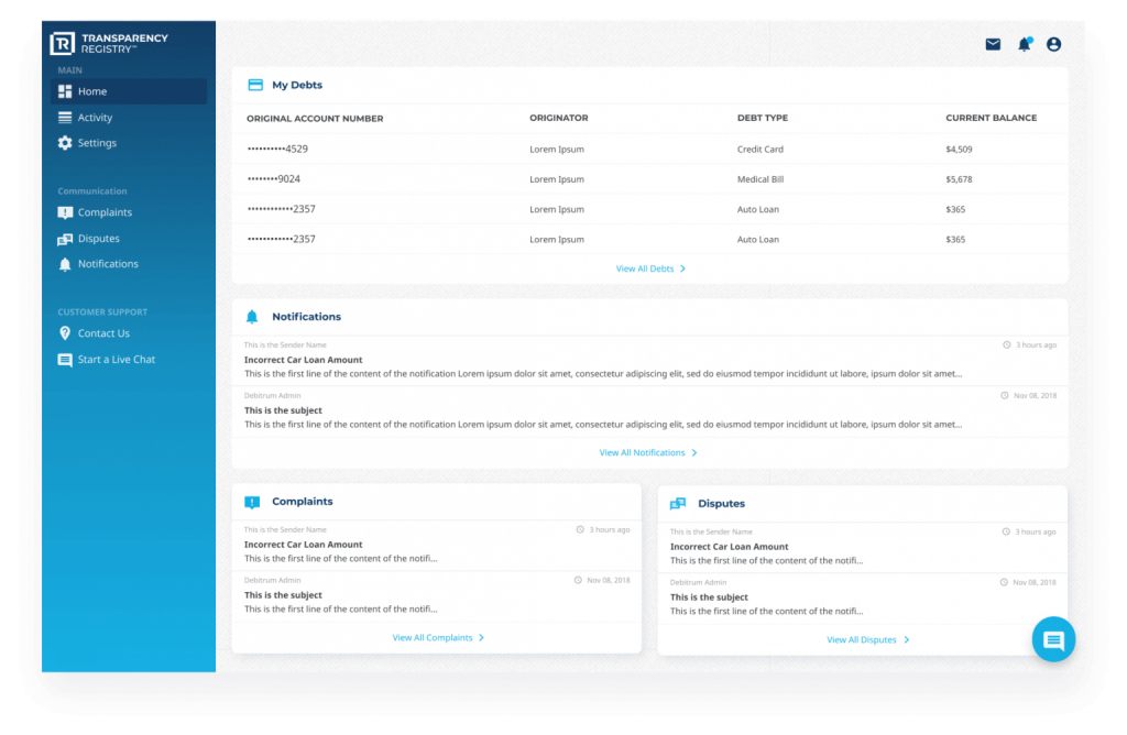
The next user category is Consumer. These are individual users who can log into the platform and see a record of every debt attributed to them; who currently owns their debt, and a history of who has bought and sold it over its lifetime. Consumers can use the Transparency Registry platform to protect themselves from fraud by verifying that they are paying the right collector and that they are being counted as “paid”.
Designing for Consumers
The next user category is Consumer. These are individual users who can log into the platform and see a record of every debt attributed to them; who currently owns their debt, and a history of who has bought and sold it over its lifetime. Consumers can use the Transparency Registry platform to protect themselves from fraud by verifying that they are paying the right collector and that they are being counted as “paid”.
Designing for Admins
Another significant value prop of the platform is that because registered debt is verified, it is easier to sell it later for higher margins than the similar debt that is unverified and potentially fraudulent. The process for substantiating the debt registration is robust and involves confirming the legitimacy of the reporting organization as well as verifying the information they provide.
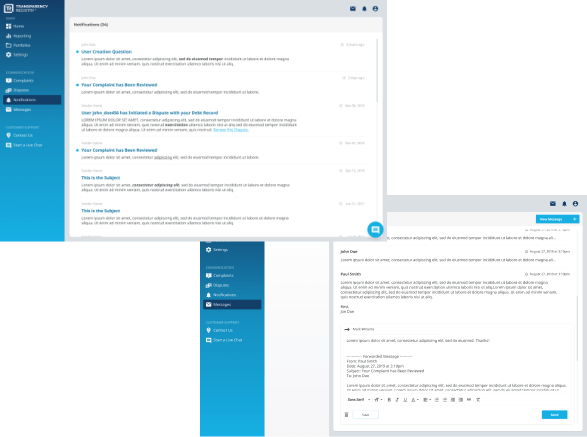
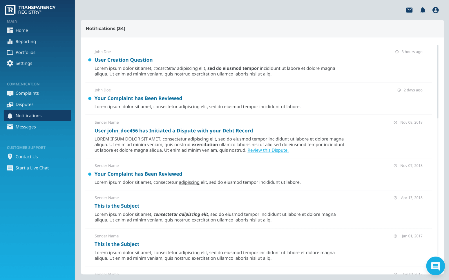
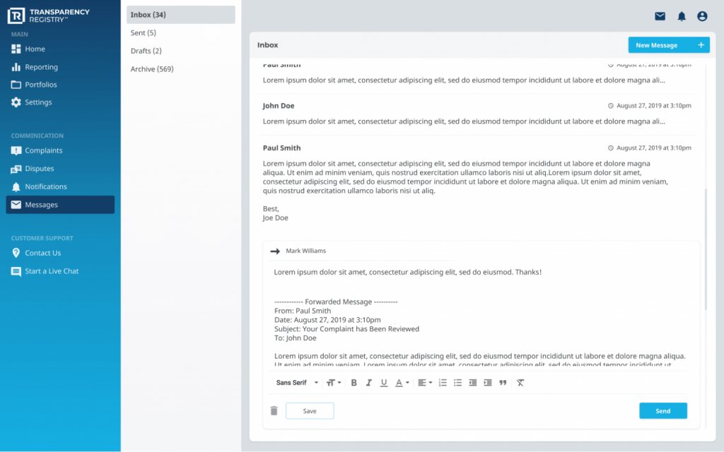
There are many steps required to achieve this. All of them include providing Transparency Registry administrators and the organizations themselves with tools for uploading authentication documents, managing a network of users, and providing messaging and notifications within the platform.
There are many steps required to achieve this. All of them include providing Transparency Registry administrators and the organizations themselves with tools for uploading authentication documents, managing a network of users, and providing messaging and notifications within the platform.
There are many steps required to achieve this. All of them include providing Transparency Registry administrators and the organizations themselves with tools for uploading authentication documents, managing a network of users, and providing messaging and notifications within the platform.
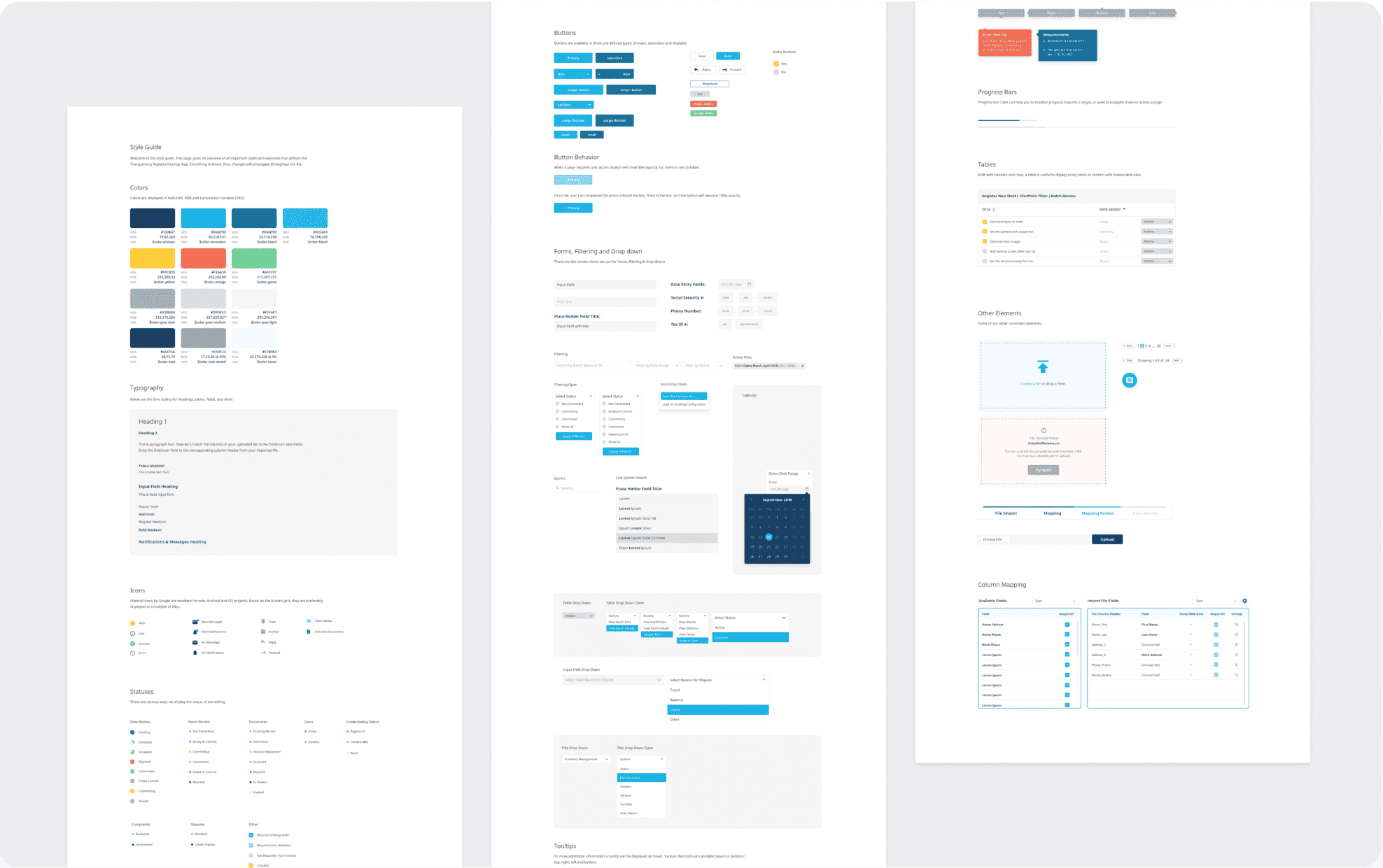
One platform. One file. One truth. One design.
As you can imagine, having an audience that consists of multi-million dollar organizations, small community lenders, top-level government agencies, and individual consumers with loans and mortgage debt provided a unique challenge of its own. How can we design a user interface that positions Transparency Registry both as a friendly, easy to use platform, while also communicates the intense level of security and dependability necessary to earn the trust of major financial institutions? The answer to this question came by focusing on clean, simple design and best UX/UI practices. We aimed to keep design components modern but not cutting edge, and familiar without being dated. The color story is kind and inviting, but still strong and dependable. Behind the scenes, a complicated and intense network of technology and code is working to collect each user’s information and keep it safe and secure. But the user should feel that the process is as simple as checking their bank account online.
The Outcome
Hear from the Transparency Registry CEO, Chris LaFleur:
With Forcoda’s help, we were able to raise $1.2 million in the seed round.
Their wireframe development was impressive and didn’t lead to any delays. Great communication and strong relationships are a top priority for them to make for a successful partnership
The success story for Transparency Registry is still on-going. However, we are proud to say that using our prototypes in the pitch process, Transparency Registry was able to raise 1.2M in their last investment round.
Interested In Partnering with Us?
We’re invested in your success from day one; from concept stage right to the completion of your project. We value long-term partnerships with our customers and love being a part of their success stories!